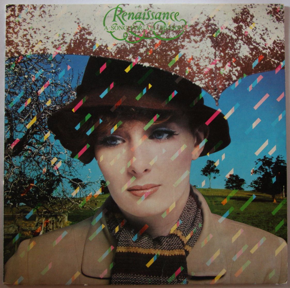
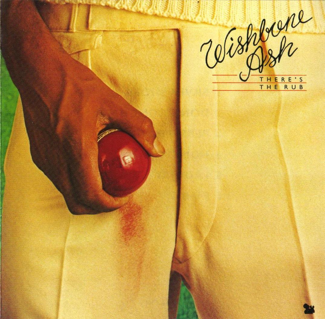
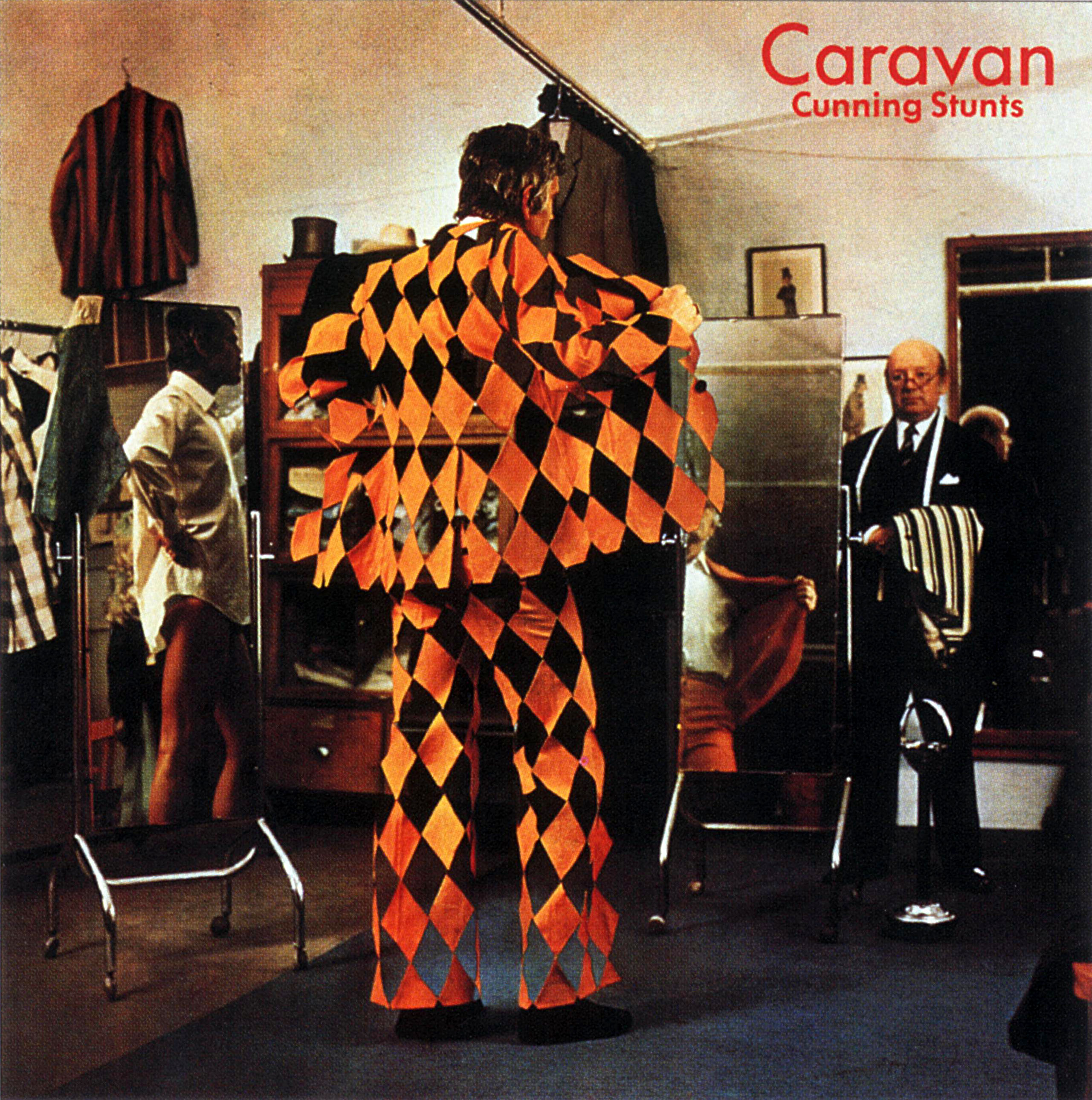
 Hipgnosis is The Beatles of album cover art — nobody has ever done it better than the British design firm founded by Storm Thorgerson and Aubrey Powell. Their first cover was Pink Floyd’s 1968 album A Saucerful of Secrets and their last was Led Zeppelin’s Coda, released in 1982. There’s quite a bit of poetry in that. In their fifteen years together the firm produced many of the most iconic covers in music history. Below is a gallery of all 190 Hipgnosis covers. Do you have a favorite? I’m listening.
For more information check out the book For the Love of Vinyl: The Album Art of Hipgnosis. (Note: I couldn’t find an image of Hignosis’s 48th album cover, 1972’s self-titled Danta.)


Leave a comment