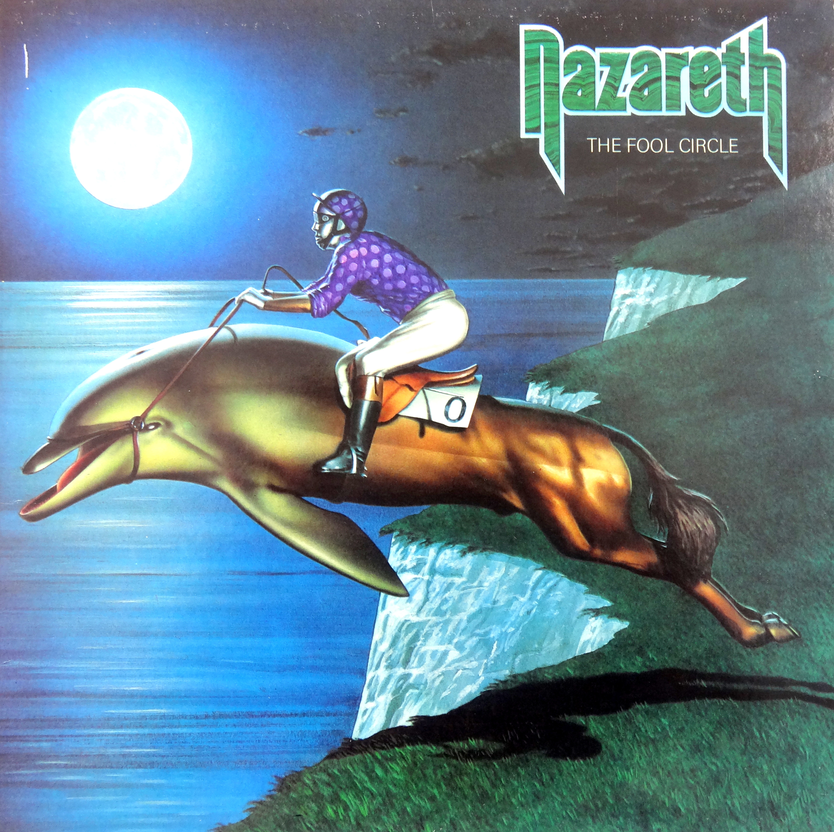
The cover art for Nazareth’s The Fool Circle remains one of my all time favorites. During my years in art school a common criticism leveled at my work was that it was “too narrative.” I took the news hard, never considering the fact that I loved work like you see to your left: paintings that…
The cover art for Nazareth’s The Fool Circle remains one of my all time favorites. During my years in art school a common criticism leveled at my work was that it was “too narrative.” I took the news hard, never considering the fact that I loved work like you see to your left: paintings that tell unspoken stories, narrative work.
Album sleeve artists and designers are easily the most overlooked popular artists to ever pick up a conte crayon. Especially prior to MTV, our visual appreciation of an album depended almost entirely on the package in which it came.
Take Meatloaf’s Bat Out Of Hell, for example. As a boy I knew that album from Richard Corben’s insane cover painting long before I knew the music, but I didn’t know who out of hell Corben was for several more years. Bat Out Of Hell for me was as much the cover as the music.
In The Fool Circle’s case the sleeve was more entertaining for me than the music. There’s nothing wrong with the album, but if I’m honest about the hours spent over the last thirty years thinking about, looking at, or listening to that album, the majority of them have been spent on the cover art.
So when it came time to chat with the folks responsible for Fool Circle, I didn’t gun for the band. No, I went looking for cover designer Alan Schmidt.
For the most part Schmidt has hung up his commercial art cleats, having moved both to Norfolk (that’s England, not West Virginia) and fine art roughly a decade ago. His recent paintings bear little resemblance to his best known commercial work, but as you’ll read it isn’t at all out of character; in fact, Schmidt’s style in a sense has come full circle, back to the prints and posters that inspired him as a young art school troublemaker.
Why It Matters: Let’s start where stories often do, at the beginning, and with artists the beginning usually means influences. Who and what were yours?
Alan Schmidt: My earliest visual memory was of the box of a Meccano Set [Erector Set – ed.], unreachably high on top of a wardrobe. That very particular combination of yellow, red, blue and black remains with me; I can even see a Meccano tin label on a nearby shelf as I write this.
“Next the Sea,” by Alan Schmidt. Used with permission.
I’ve also had a lifelong love affair with the ‘Golden Age’ of travel posters in the 1920s and ’30s: flat, colourist images and landscapes combined with type, that are so present in my current work.
Jump from there to the orange crate labels from the California litho printers of the ‘30s to the ’50s, and from that outstanding print tradition to the ‘Graphic Renaissance’ of the West Coast posters of the Psychedelic Sixties. Rick Griffin, Kelly and Mouse Studios completely blew me (and a whole generation!) away with their outrageous synthesis of styles – Art Nouveau meets Alchemy, via Lil’ Abner and the Kama Sutra? That’s my kind of role model!
WIM: You’re not wrong. Rick Griffin in particular is an artist that I’d expect most music and psychedelia lovers to know by name. What other things get your creative juices flowing?
AS: Found objects, strange conjunctions, tin toys, Victorian scrapbook pieces, dog-eared books and tattered magazines – the list is endless; the sole criterion being that it catches my eye. It’s simply a matter of recognising it whenever, wherever or however you see whatever turns you on, and mentally squirreling it away for future acts of piracy!
WIM: Oh, now. Piracy seems awfully; well, awfully honest, come to think of it. We all grab from here and there, don’t we? How about formal education – were you an art school lad?
AS: I somehow managed to graduate with a degree in Art History from UEA [University of East Anglia – ed.] having spent three blissful years concentrating on my own poster design, getting a terrific band together and working semi-professionally, and doing all the other things that made the ‘60s such a jolly experience!
WIM: I’m not sure you understand how wonderfully romantic that sounds to me, having been born at the tail end of the sixties. What was your main period of study?
AS: Academically, to use the word in its loosest sense, I’d elected to study a weird mix that reflected my weird enthusiasms for both Dada/Surrealism and all things Medieval. My visual and literary tastes always having run to the eclectic and peculiar long before some Clever Trevor came up with the idea of ‘Post Modern Irony’!
“The Ultimate Question,” Alan Schmidt. Used with permission.
I suppose it’s exactly those dual strands that come together in one of my most recent pieces, “The Ultimate Question.” The catalyst for the painting was visiting the breathtaking exhibition of Illuminated Royal Manuscripts at The British Library a while back. It confirmed to me that those boys slaving over a hot quill in their scriptoria matched anything and everything visual that had come before or has come after them. Their design sensibility, letterforms, linear mastery, colour sense, and the sheer genius of their visual literacy & inventiveness define everything that I’ve ever been drawn to in art.
My own piece combines references drawn/adapted from a dozen different manuscript sources and add a sting in the tail – I love the idea of coming up with work that draws you in with a visual ‘wow’ factor and then deflates itself and your expectations with a bit of a Dadaist poke in the ribs.
WIM: I couldn’t help but laugh at that piece. I was reminded of a painting professor I had who told us that he relaxed about the “importance” of his work after his first show. Apparently a well-heeled couple was admiring one of his masterpieces and the wife said, “This one is really lovely. Can you do it again in salmon to match our couch?”
AS: So much mind-numbing bullshit is talked in terms of “critical theory” and “the conceptual aesthetic” that I love the opportunity of humorously raising two fingers to it [American translation: one finger, namely the middle one. -ed] Hence my choice of a visual rather than an academic career and a certain reluctance in asking former tutors for references!
WIM: Let’s jump ahead to your time in the music business.
Early Alan Schmidt poster for a Rennaissance gig at UEA. Check out the opening act down in the fine print. Used with permission.
AS: I came to Phonogram as Art Director in 1977 with a background as both a performing musician –having led my own folk/blues band ‘Totem’, formed at the University of
East Anglia in 1968, and lasting for about 6 years – and perhaps more importantly having been a pretty active poster designer during much the same period.
Between ’68 & ’72 I‘d designed in excess of 50 silkscreen editions , largely music-related for all the big university gigs, for friends in the business, festivals and for my own band. About a dozen of these were recently incorporated into the sleeve and an insert lyric booklet along with a whole lot of my hand-lettered titling and a new logo for the mightily successful debut album of Australian duo, Tim & Jean.
WIM: Interesting, so you haven’t completely hung up your commercial pencils yet.
AS: Actually, on the strength of all the original long-ago stuff I’ve just been commissioned to design a limited edition poster/print for UEA’s Fiftieth Anniversary Festival in September of this year. All I need to come up with now is the idea!
WIM: Well that’s exciting times. I hope you’ll be making that one available as a print. Do you have any idea how many album covers you worked on, or is that time a bit of a blur?
AS: I guess that I was probably involved with around 100 album covers during the late ’70s and early ’80s, though I’ve never added them up, following on from a first break doing the Steeleye Span Rocket Cottage package launched for the band’s first solo tour of America, and completed shortly before the Phonogram era.
WIM: Let’s talk about that. What was it like at Phonogram during the seventies?
AS: Dealing with an enormously varied artist roster meant that one was involved with everything from highbrow classics for Deutsche Gramophon and Phillips (the parent company) through hard rock (Nazareth, Black Sabbath, Status Quo, Ramones, etc.), soft rock (Godley and Crème, Boomtown Rats, Dire Straits, Lindisfarne, Van Morrison, etc.) to what can best be described as “Silken Sounds for Cloth Ears” in the form of some very iffy MOR and easy listening.
WIM: How in the world is it 2013 and the album Silken Sounds for Cloth Ears hasn’t been released? What a brilliant title that would be. It reminds me of my fourth grade music teacher, who was always telling us to open our “beautiful velveteen ears.”
AS: All in all it involved constant creative gear shifts and the never-ending diplomacy involved in frequent dealings with the tricky combination of over-inflated egos all too often coupled with alarmingly slim talents. One rapidly came to realise that everybody and their little brothers considered themselves experts when it came to designing album covers.
WIM: I can’t even imagine. “Can you do it again, but in salmon?”
AS: In common with most art directors/designers, I often felt that my best ideas were the ones that either failed to see the light of day or which were compromised beyond redemption by the tinkering of those self-appointed committees of experts sent to reduce us to gibbering frustration.
I was once present at a meeting when a superb and ruinously expensive hyper-realist portrait of a singer who shall be nameless was consigned to oblivion. After it had already been enthusiastically approved by the said Artiste and both his managers, the secretary bringing in the coffee caught a glimpse of it and said, “Doesn’t it make him look a bit old?” It didn’t, but that was all it took for weeks of work to be binned.
WIM: You realize that right now I’m both shaking my head at that story and trying to figure out what Phonogram artist that may have been. Did that sort of disconnect occur with your work?
AS: I picked up half a dozen design awards over that period but, ironically, they were generally for the things I liked least. In fact, one of many classic examples of Sod’s Law [American translation: Murphy’s Law -ed.] working at full throttle is that of all the many logos I’ve ever designed from that time the one with apparently endless longevity is the one that makes me cringe whenever I see it.
For their debut album, On Through the Night, I designed Def Leppard’s logo to sit on two lines set one above the other and
forming a triangle. All the letterforms within it were specifically contorted to fit that shape. For reasons totally beyond me, the designers( far too Hip to be gnamed) of the second album– with which I had no involvement – dismantled the triangle and put the
name on one single, ghastly, line, which is how it remains.
WIM: You have made a critical mistake, my friend. Now that I know that you are the designer of Def Leppard’s iconic logo I shall hound you mercilessly for a Why It Matters logo. I shall unleash my devoted following — both my mother and my grandmother — in the form of a letter writing campaign that shall barrage your mailbox with ones of letters. Or maybe I’ll just offer to pay you and hope for the best.
Anyway, Nazareth.
AS: Happily, my two covers for Nazareth – The Fool Circle and the live album, ‘Snaz – were completed with the complete cooperation and approval of the band and their management, and are all the better for it.
I seem to recall that the intention behind The Fool Circle’s title was a verbal pun, most effective when spoken with a Scots accent, on the band’s idea of coming “full circle.”
My visual response, if memory serves, was based on the idea of all life having come from the sea. Here, in the process of a totally surreal but visually coherent transformation, the sleek, thoroughbred lines of the racehorse morph cleanly into the even sleeker, primal form of the dolphin as both horse and rider — metaphors, perhaps, for the sophistication of life on Earth and the idea of fools and their gambled money being soon parted– are plunging back into the primordial depths.
Holy shit, did I just say that?! Top candidate for the Brass Bollocks Award!
WIM: You did, and I just downloaded the nomination form. But listen: If I came up with that cover I’d be wearing an ascot and a monocle and smoking a pipe, so all things considered you’re doing fine.
AS: Anyhow, a highly finished visual was approved then handed over to Chris Moore, the star airbrush illustrator, who worked his usual magic and brought the idea to life.
Ironically, that original artwork, which was one of very few that I retained over the years, was irretrievably damaged by a leaking studio roof a couple of years ago.
WIM: That is devastating news!
AS: A salutary lesson on impermanence and the need for regular home maintenance….
WIM: You’re working now in gouache [an opaque watercolor -ed.] on paper. Why?
AS: Around ten years back I returned to producing my own stuff after a temporary 20 year diversion into the highways and byways of design education, and inevitably I chose a designer’s medium when that time came.
In fact that was when I finally sold off half a dozen collapsing boxes of seldom played vinyl and spent the proceeds on setting myself up with the whole, very costly, range of German paint to which I’m still devoted. I use Schminke Horadam gouache, a wonderful range of colours with intense pigmentation and a high gum-arabic content for light-fastness. I love their flat intense colour, fast drying opacity and particularly their forgiving nature: the fact that they are instantly revivable from a dried-up saucer and will cover most screw-ups in a single coat.
WIM: This is where I normally ask “why does music matter to…”, but that question seems too narrow here so I’ll modify it:Why do the arts matter to Alan Schmidt?
AS: One way or another they’ve been my life – ‘nuff said.
Responses to “Why It Matters to Artist Alan Schmidt”
Brunno Nunes
Hi, my name is Brunno Nunes, I’m the editor of a blog dedicated to Dire Straits and Mark Knopfler, called Universo Dire Straits.
I need your help to find some way of contacting Alan Schmidt, who you interviewed in 2013, it turns out he did the cover design for Dire Straits and Chuck Loyola’s first album and I did some research and found something I believe to be possible, however, I need to ask him in order to better substantiate my thesis.
I’ll leave the link to what it is, I would like your opinion too.
Interview With Alan Schmidt on Boomtown Rats Website « Why It Matters
[…] tremendous pleasure of meeting Alan Schmidt, a new best friend I’ll never meet. We enjoyed our conversation so much that we’ve kept it going, and the more we chat the more fascinating I find […]
I fully appreciate Mr. Schmidt’s influences. I find those (and his) flat, colorist images evoke some feeling of wonder within me. There is a lonely feel, for some reason. I may just be having some sort of Proustian memory poke.
Thanks for another great interview, James.
 The cover art for Nazareth’s The Fool Circle remains one of my all time favorites. During my years in art school a common criticism leveled at my work was that it was “too narrative.” I took the news hard, never considering the fact that I loved work like you see to your left: paintings that tell unspoken stories, narrative work.


AS: I guess that I was probably involved with around 100 album covers during the late ’70s and early ’80s, though I’ve never added them up, following on from a first break doing the Steeleye Span Rocket Cottage package launched for the band’s first solo tour of America, and completed shortly before the Phonogram era.

For their debut album, On Through the Night, I designed Def Leppard’s logo to sit on two lines set one above the other and

AS: Happily, my two covers for Nazareth – The Fool Circle and the live album, ‘Snaz – were completed with the complete cooperation and approval of the band and their management, and are all the better for it.


Leave a comment